if your programming skills are limited, then you could use the below code to integrate google charts to your intranet or internet web site.
As i first step i usually visit the the google charts page and select a chart that matches my desired outcome. Lets say that we have a list of cd collections that we want to process and we need to know graphically how many we have already processed or not. For that i would choose a pie chart.
Mysql Part
Next we need to retrieve the necessary data from the database using the appropriate query.
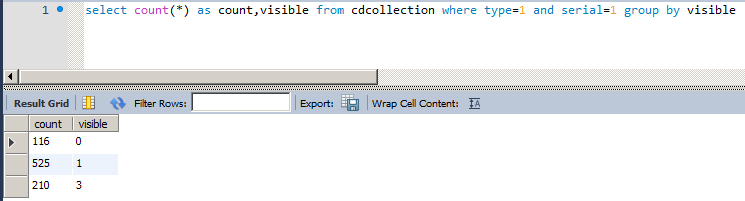
mysql_queryIn my case i only need to have two columns, one that shows the cd collection visibility type (1=visible, 0= hidden, 3=other status), and the count of each type of visibility.
PHP Part
Next, the php part of the mysql connection:
mysql_select_db($database_localhost, $localhost);
$query_Recordset1 = "select count(*) as count,visible from cdcollection where type=1 and serial=1 group by visible";
$Recordset1 = mysql_query($query_Recordset1, $localhost) or die(mysql_error());
$row_Recordset1 = mysql_fetch_assoc($Recordset1);
$totalRows_Recordset1 = mysql_num_rows($Recordset1);
Then right below add the following script part, which basically transform the data array to json and then it uses it to create the chart.
<script type="text/javascript">
google.load("visualization", "1", {packages:["corechart"]});
google.setOnLoadCallback(drawChart1);
function drawChart1() {
var data = google.visualization.arrayToDataTable(<?php echo json_encode($data)?>);

 var options = {
 title: 'Collections',
 hAxis: {title: 'Year', titleTextStyle: {color: 'red'}},
 colors: ['#e0440e', '#e6693e', '#ec8f6e', '#f3b49f', '#f6c7b6']
 };


var chart = new google.visualization.PieChart(document.getElementById('chart_div1'));
 chart.draw(data, options);
</script>
I am explaining the red parts of the above code:
The json_encode($data) part transform the $data array to json. So in the mysql part if you used some other name for your dataset it should also be changed here.
The part right after “var options = { “ includes all the settings of the chart. This is where you specify the title, the colour style, the fonts etc. Depending on what you need to do adequate documentation exists on the net..
Finally, the last red part PieChart is where you tell the api what chart you need it to render. This could be modified to ColumnChart or Histogram or any other form the available options you can find in the google chart development page.
See below the dashboard i have create for my self using three different recordsets.